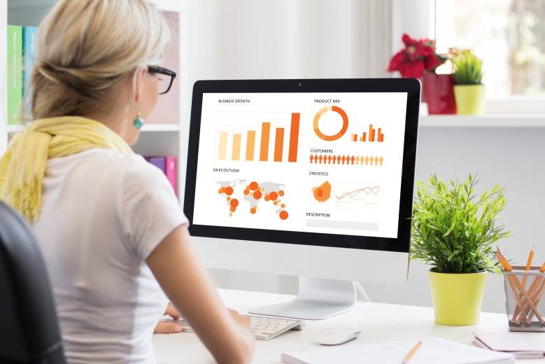
There are ways data is represented visually. This is done through graphs, charts, and patterns. Trends and correlations between different data objects are depicted through data visualization. Managers who have to take decisions based on the trends and analysis use varied tools and softwares available to create user friendly formats of data representation. This representation is made interactive through various flowcharts, infographics, and other tools available to create a pictorial representation.
 How is Visual Representation Used?
Each representation of visual data has some significance. There are tools like, spreadsheet, pie charts, heat maps, etc. that help in creating visual data. Used to analyze the factors that influence the buying behavior of the customers, visual representation can also predict the volume of sales, categorizing which product has more sales.
Embedded Tools
Most of the software that is used for business purpose is embedded with these tools. Since, the advent of big data, data visualization has gained more prominence. When data is sorted and mined from its raw state into a readable, meaningful format, it can be used to create data visualization objects. It provides the users quantitative information on data, giving it a visual appeal. When information in metrics and numbers can be monotonous, data visualization provides an interesting way of representing data. You can convert your data to animation, graphics, and many other formats of visual representation.
Collaborative and Effective
It helps to collaborate with associates and clients faster, as the information that is represented is easily grasped within a glance of a few seconds. It makes the communication and collaborative efforts creative.
Conclusion
Data visualization has changed the way data is used to provide information. No statistical or numerical data is banal anymore. With this format of data representation, decision making becomes faster and effective.
{{cta(‘dc873849-8f8c-4c79-a890-5652bb0b20c2’)}}


